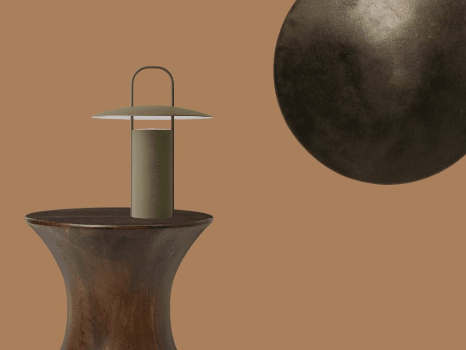
Transitional seasons are, hands down, the best periods of the year. You can’t argue against clear skies, cool breezes, and a welcomed break from the hellish heat of Summer, and the frigid icy blasts of Winter. So, as Autumn rolls around and the Summer heat bids us all adieu, it’s time to break out the cosy sweaters, indulge in an extra morning cuppa, and maybe consider cranking the heater (dare we say fireplace) on cooler evenings. But most importantly, it signifies the time to start thinking about how you’ll bring those delicious autumnal vibes into your home decor.
The answer is colour, and that’s where we come in! You see colour absolutely helps set a mood, and the must-have mood for the transition from Summer to Winter is cosiness and hygge. And because we can’t get enough colour, we’re sharing three top contenders to take centrestage (or at least a one-season feature) in your home. So, whether you’re into warm amber hues, moody blue-gray shades, or bright pops of yellow, there’s an autumn color trend for every style and mood – let’s explore!
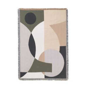
Spiced Honey
Bet you’re thinking…what exactly is Spiced Honey-sounds as cliched as a Pumpkin Spiced Latte. But before you go reading a book by it’s cover, don’t be such a judge Judy, and hear us out. This warm, amber hue, inspired by the stunning Autumn leaves, brings an immediate injection of warmth and luxury to any room. Choose your own adventure and make it a statement wall, or tepidly dip your toes into the honeypot with accent with pillows, throws, and accessories, either way, it will surely add cosiness and comfort to your space.
Colours on this side of the spectrum complement really well with earthy greens, rich browns, and bronzed brasses. And to really embrace the autumn vibe and go full interior design druid, add some wood accents or textured materials. Spiced Honey works well in any room, from the living room to the bedroom and even the bathroom, just be sure to balance it out with some lighter accents to avoid feeling too heavy and weighed down.
Stormy Weather
We all share that childhood core memory of battening down the hatches, getting all snuggly in bed under a doona, as a wild thunderstorm blasts uncontrollably outside. And that’s the exact feel our next colour aims to bring…just far less damp.
Introducing Stormy Weather, a blue-gray shade that’s dedicated to creating atmosphere. Use it as a statement wall or layer with autumnal hues such as burnt orange and deep red for a cosy, inviting atmosphere. Feeling daring? Yeah you are! Combine Stormy Weather with a statement colour like emerald or sapphire for a bold look. This hue is perfect for bedrooms and living rooms, where you can fully relax in its sophisticated comfort. Want to add some drama? Paint an entire room in this shade and complement with crisp white accents. Our last piece of advice: keep the mood light with some lighter elements to avoid feeling too heavy. Let’s chase those stormy skies!
Illuminating
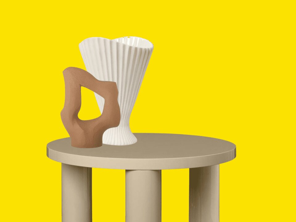
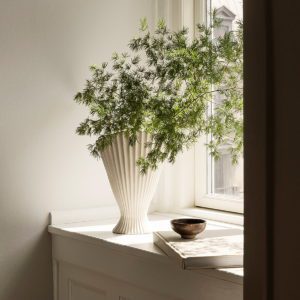
To switch things up, let’s challenge the typical autumn color scheme with Pantone’s 2021 Color of the Year: Illuminating, a cheerful, sunny yellow and a burst of joy for overcast autumn days. Use it sparingly as a highlight or make a bold statement with a yellow lounge suite or armchair. However, make sure you’re pairing “Illuminating” with neutral tones to keep the space from feeling cluttered.
This hue is ideal for adding a touch of cheer to your dining room or kitchen, but can also work in your lounge room or bedroom. If you’re not quite ready to fully embrace this bold shade, start small with yellow accents such as candles, vases, or a snug throw rug. Illuminate your space with this sunny yellow!
So, ready to give your makeover for the autumn season? Yeah you got this, baby, we believe in you! Say goodbye to outdated shades like “Icy Blues” and “Pale Grays” and say hello to more inviting or playful hues like “Spiced Honey”, “Illuminating”, and “Stormy Weather. Spice up your autumn decor with these trendy and playful colors and create a space that’s as unique and design-savvy as you are!