Colour has the power to transform our living spaces, creating inspiring atmospheres that resonate with our emotions and taste. When it comes to injecting energy and vibrancy into your home, few colours can rival the captivating charm of red. Known for its warmth, power, and passion, red is a hue that demands attention. However, working with red requires a thoughtful approach to ensure a harmonious and balanced outcome.
In this post, we’ll explore the art of decorating with red, offering insights, tips, and design ideas to help you infuse this bold colour into your home. From understanding colour theory to considering spatial perception and avoiding common pitfalls, join us on this journey to unleash the captivating allure of red throughout your spaces.
Let’s Start With The Basics: What Exactly Is Colour Theory?
Colour theory is the study of how colours interact with each other and how they affect our perceptions and emotions. It helps us understand how to effectively use colours in various design contexts. The colour wheel is a fundamental tool used in colour theory. It consists of primary colours (red, blue, and yellow), secondary colours (orange, green, and purple), and tertiary colours (formed by mixing primary and secondary colours).
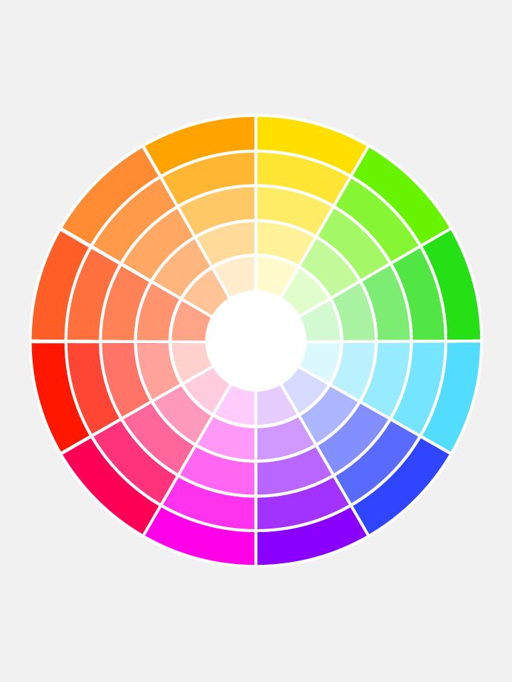
The colour wheel is the ULTIMATE tool when creating your own palettes. Consider where each colour sits to help determine if your palette is based on contrast or harmony.
Pairings of lighter red hues create a youthful and playful feel, whilst also feeling relaxed and soothing.

Red and green sit opposite the wheel and create serious contrast and vibrance when paired together.
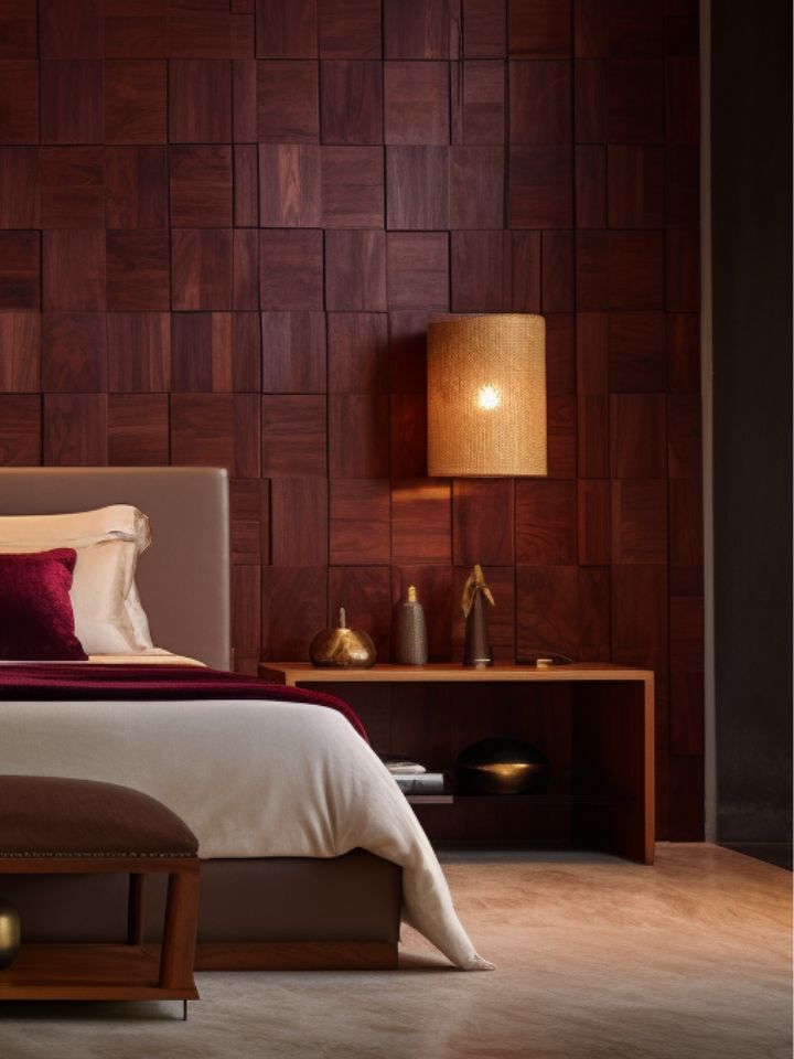
Darker tones of reds and browns create a warm and cosy feel, and work really well with golds for a luxe feel.
And when it comes to Colour Theory, where does Red sit?
Now, let’s focus on the colour red. Red is a warm and energetic colour associated with power, passion, and excitement. It has the longest wavelength among visible colours, making it highly noticeable and attention-grabbing. Here are some key aspects of red and how they can be used in interior design:
Emotional Impact:
Red is known to stimulate emotions and create a sense of intensity. It can evoke feelings of love, energy, and even aggression. Due to its strong impact, it’s best to use red as an accent colour rather than overwhelming a space with it.
Spatial Perception:
Red has the ability to visually advance, making objects or surfaces painted in red appear closer than they actually are. This quality can be used strategically to make a room feel cosier or to draw attention to specific areas.
Complementary Colours:
Green is the complementary colour to red, as they are opposite each other on the colour wheel. When used together, they create a vibrant and visually striking contrast. Incorporating green accents or foliage in a room with red elements can create a balanced and visually appealing composition.
Colour Combinations:
Red pairs well with various colours, depending on the desired mood and style. For a bold and energetic look, combine red with black or white. Red and gold create a luxurious and opulent atmosphere, while red and beige can evoke a warm and cosy feeling. Red can also be used as a pop of colour in neutral colour schemes, such as grey or taupe.
Intensity and Shade:
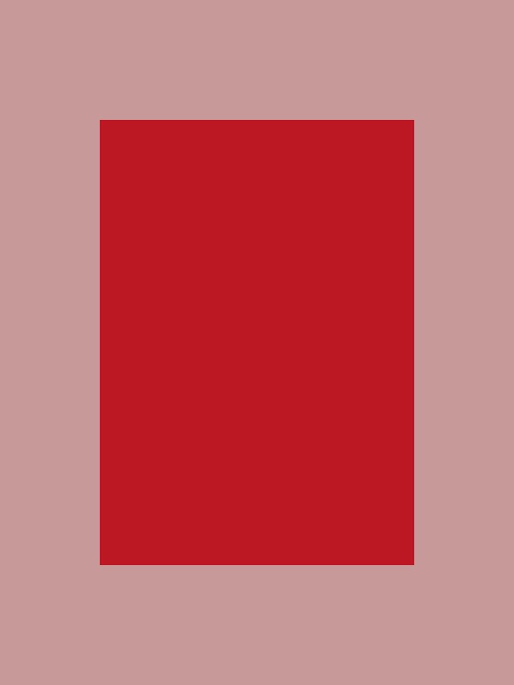
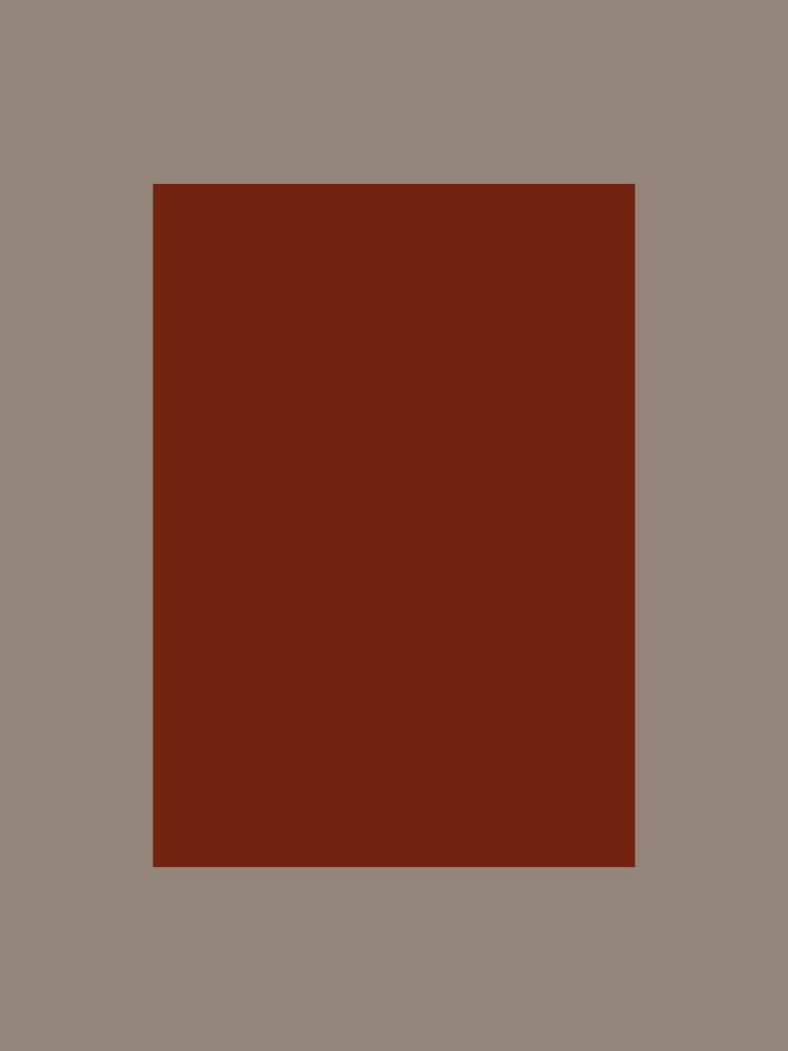
Red can range from vibrant and bright to deep and rich. Consider the intensity of red you want to incorporate based on the desired atmosphere. Lighter shades of red, such as coral or pink, can create a more playful and youthful vibe, while deeper shades like burgundy or maroon can add sophistication and elegance. Weaving tones of red together will deliver a relaxed and seamless vibe.
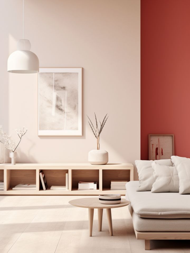
Paint In An Accent Wall
We’ll start with the obvious – accent walls. Painting an accent wall in a bold shade of red is a fast way of introducing colour, whilst adding a dynamic element to your room. But before you go running off, paintbrush in hand, stop and think. It’s important to choose the right wall to ensure it has the desired impact. Consider surfaces that naturally draw attention, such as those behind a bed, sofa, or fireplace. The ol’ accent wall technique works well in spaces where you want to create a sense of drama or make a strong visual statement. When selecting the shade of red, consider the overall mood you want to achieve. Deep, rich reds like burgundy or ruby create a sense of luxury and elegance, while brighter reds like cherry or crimson can add vibrancy and energy.
Red walls really aren’t my thing – what’s a decent alternative?
Look, we get it, a solid block of red is a lot to deal with. Even the most diehard of red lovers might find it a bit much. But you’ve got options, and here’s two we recommend:
Find a red tile you love and install it on the accent wall. The result will be bold and visually striking, but softened by the texture and shine of the medium. Consider mosaic tiles, subway tiles, or larger format tiles, and you’re on your way to creating the perfect red focal point.
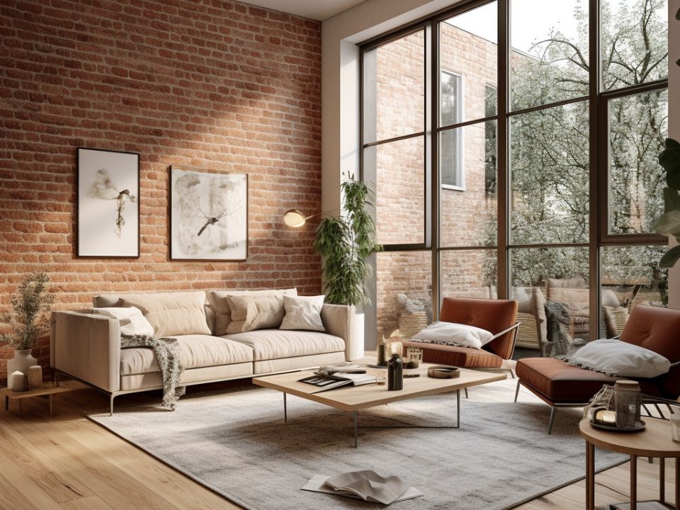
Exposed red brick, timber panels, or red stone walls can create a rustic, industrial, or even a Mediterranean-inspired look. If you’re lucky enough to have a wall with exposed brick or stone, consider leaving it in its natural state or applying a clear sealant to enhance the colour. Alternatively, you can use faux brick or stone veneer panels to achieve a similar effect.
Artwork may be all you need!
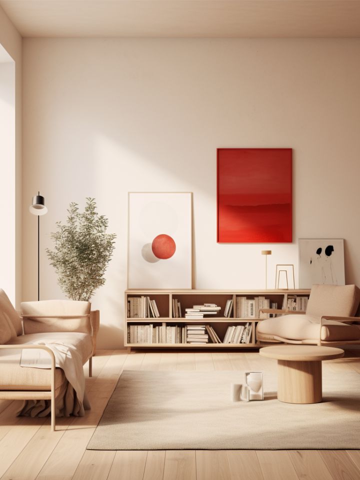
The simplest way of bringing a splash of red to your home is through artwork. The tricky part is finding that perfect piece. Start by considering whether you want the red to dominate or complement, and start your search from there. Consider abstract paintings with red brushstrokes or photographs with a hint of primary red. Level up by working in a splash of deep purple/wine or a bright orange – they’ll look great with the red.
When it comes to arrangement, your main priority should be balance and scale. If you have a large red artwork piece, you’ve got yourself a great focal point for a larger wall or space. If you’ve got lots of smaller pieces, group them to create a tidy gallery wall to help tell your red colour story.
-
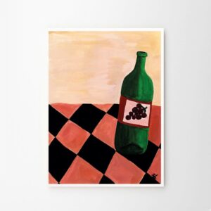
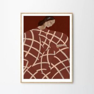
 THE POSTER CLUB Sandra Blomen Maschinsky, Dressed Art Print, A5
 -
 THE POSTER CLUB Kristina Siljefors, Flarra Art Print, A5
 -
 THE POSTER CLUB Low Siew Lee, Lights, Poster Art Print, 40x50cm
 -
 THE POSTER CLUB By Garmi, Abstraction, Poster Art Print, 50x50cm
 -
 THE POSTER CLUB Sofia Lind, Waiting At Art Et Metiers, Poster Art Print 50x70cm
Accents and accessories won’t let you down
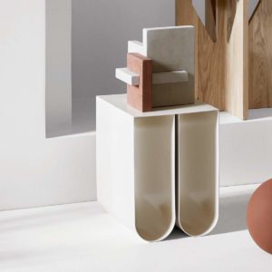
Similar to artwork, home decor, in all its various shapes and forms, is a great avenue to pursue for all your red interior endeavours. From sculpture to soft furnishings, the options are virtually endless, it all comes down to deciding where you want the red to feature and how much of it you’re after.
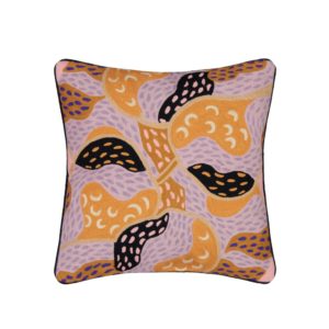
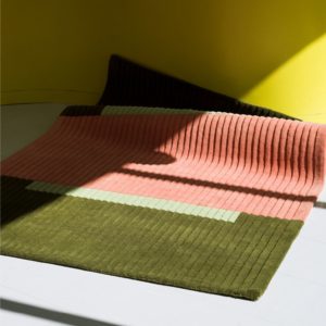
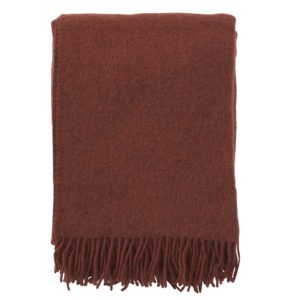
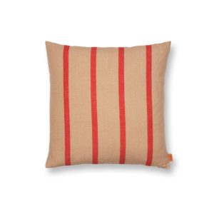
Soft furnishings are a brilliant place to get started – cushions, throws, rugs (a few ideas below):
And so are decor, trays, and sculptural pieces (even more ideas below):
You best be avoiding…
Despite our absolute love of the colour, too much of a red thing can lead to a design disaster. So, when navigating this bold and passionate colour, remember to follow our tips below:
Overwhelming Dominance:
Red grabs attention, and it does it aggressively. This can lead to troubles when used, so excessively or in large areas; it can be overpowering. We generally say it’s best to use red as an accent colour rather than covering vast spaces in red – it’s all about balance and working smart with what you’ve got.
Emotional Intensity:
Red is known to evoke really strong emotions – like super powerful ones like passion, excitement, and even aggression. This means you should be quite mindful where the red’s going and the mood you want to create in your space. In areas intended for relaxation, like bedrooms or meditation spaces, consider using red in moderation or opting for calming softer shades such as coral or pink.
Lack of Harmony:
Like all colours, red has the potential to clash when paired incorrectly. Adventurous and skilled decorators may be able to pull off the vibrant red and green colour combo without turning the space into a cave of Christmas, but for the rest of us, sticking to the tried and trusted pairings is likely to yield more harmonious results. Try pairing red with complementary colours such as neutrals (whites, greys, beiges) or analogous colours (shades of red-orange or red-purple).
Lighting Considerations:
One little tidbit we’ve got tucked away in our bag of tricks is lighting. You see, red can be perceived as warmer under incandescent lighting and cooler under fluorescent lighting, completely changing your intended vibe. Always consider the type of lighting you have in each room and test how your chosen palette appears under different lighting conditions to make sure you’re nailing your desired aesthetic.
Perception of Space:
Dominant warm colours, such as red, can make a room feel visually smaller and more intimate. So, if you have a small space or want to create a sense of openness, keep your use of red as an accent, and hold back on sploshing it all over. As we mentioned earlier, you can incorporate red through accessories, artwork, or smaller furniture pieces.