Winter’s icy grip is starting to let go, and to be honest, it’s about damn time. Bring on Spring! As we drop the heavy layers used to combat the cold, it’s hard not to envision how we’ll be bringing some of that Springtime freshness into our homes.
There’s the obvious: flowers…

But if you’re feeling a little more adventurous like us, then take a leap and start experimenting with a new colour scheme. Taking inspiration from the great outdoors, but not necessarily flowers alone, consult those Biophilic Design principles we blogged about recently, and step into the Spring season with colours and moments that connect us with the outside.
Adding colour through decor and accessories is the simplest way we’ve found to update a space without embarking on a major renovation or refresh (we’re looking at you paint swatches!). The return of Spring brings a palette of colours to choose, and these are the ones we’re all for this season. Which hue are you?
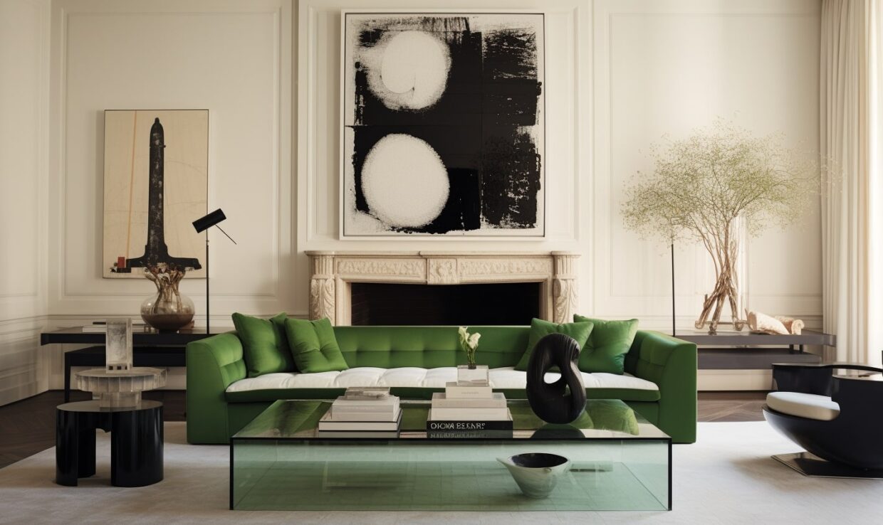
Green Is Good
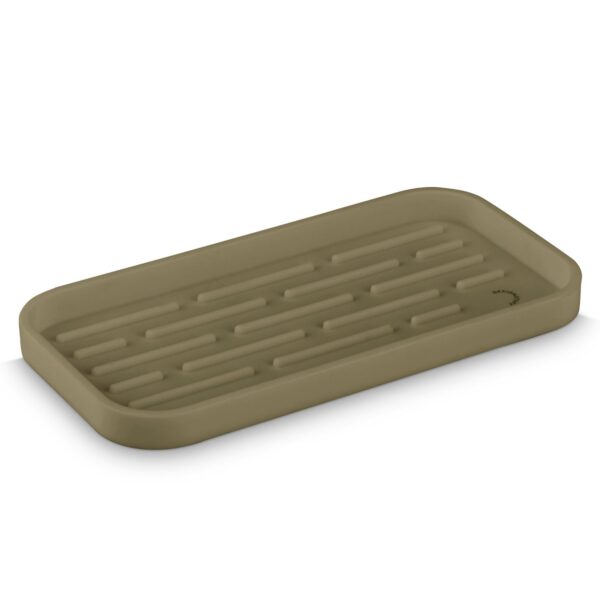
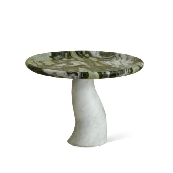
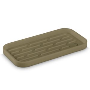
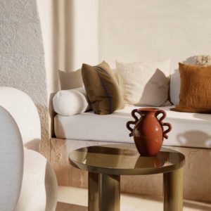
Earth tones are still having a moment, but for the Spring we’re leaning heavily into all things green. Consider it the new neutral—the beige or greige of nature. It’s the backdrop allowing the other colours to shine.
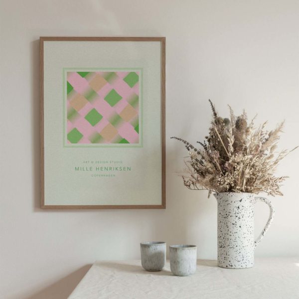
Our greens of choice: herbaceous but make it dirty. Think sage or basil with muted undertones.
Infuse your space with fresh botanics, without any of the maintenance. A carefully placed splash of green is the interior’s equivalent to a breath of fresh air, and creates a subliminal connection to nature that’s both calming and invigorating.

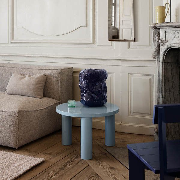
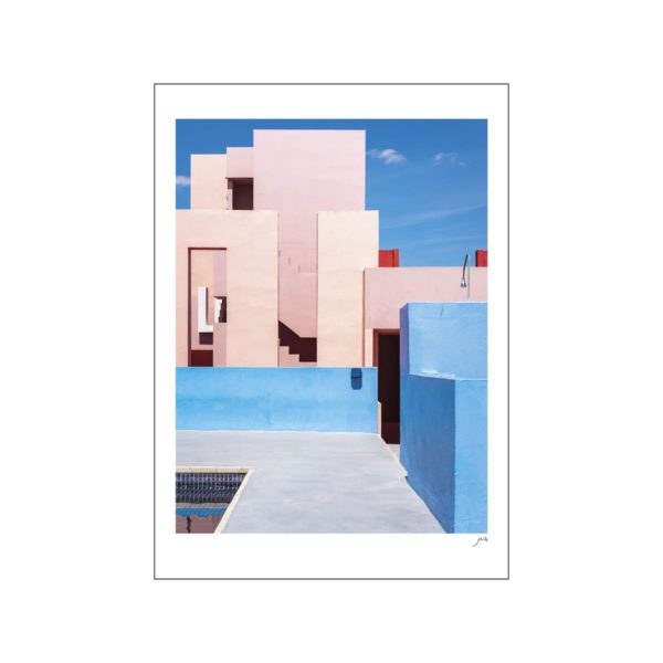
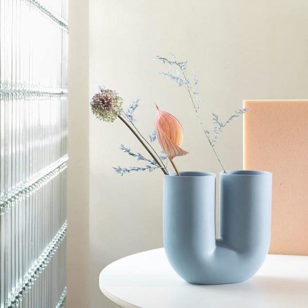
Blue Scheme Baby
Blue is the colour of calm and tranquility. It’s clear skies and serene waters, and it’s about to be the newest shade taking over your home decor.
Soft, baby, and powder are the Springtime blues of choice. Not too heavy and underlined with a sense of optimism, these subtle tints invite a renewed energy back into your home.
Don’t be fooled by blue’s calming charm, she knows how to stand on her own two feet. Whether you choose to pair her with metallic accents for a luxe touch, or warm woods and youthful pinks for a playful vibe, blue is the ultimate vocalist for the band, bringing your space to life.


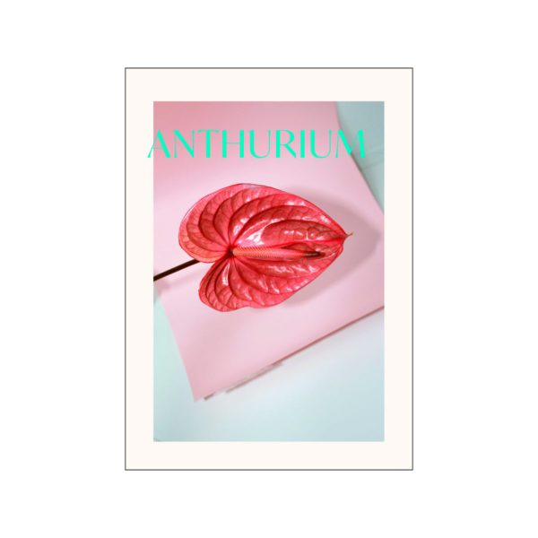
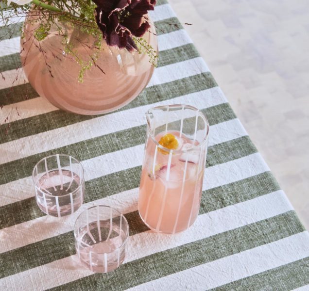
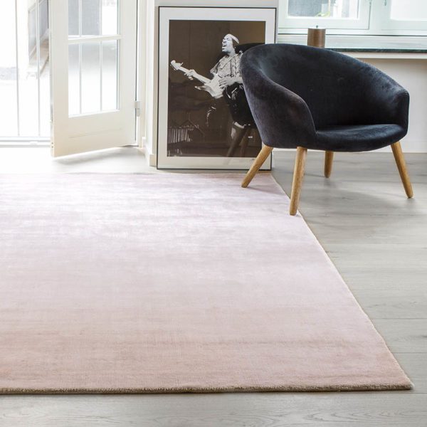
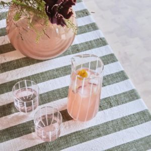
Pretty in Pink
It’s not Spring without some pops of pink. The eternal optimist of the colour spectrum, this delightful tint exudes a persona that’s equal parts vivacious and gentle. Bringing with it a sense of childlike wonder, you won’t be able to help yourself from embracing the joys of life when pink’s in play.
That’s why it’s a perfect Springtime hue for your home.
Now you might be thinking, pastel pink ain’t it, and that’s totally fine because you’ve got options. Try toughening it up with some dirty undertones; picture muted blushes mingling with hints of rose and dusky coral for a grown-up twist that still holds onto its playful spirit.
As we say see-ya-later to winter, get amongst a more lively palette that lends itself to the joy and festivity of Spring. When colour calls your name, let nature guide you towards a biophillic palette of greens, blues, and pinks. You won’t just be transforming your interiors, you’ll be reinvigorating your connection with the outside world that (maybe… probably… we’re just guessing) was dimmed by winter’s frosty touch.