Photo by Salvatore Dragone for Gorunway.com
New season = new styles = new sources of inspiration. It’s fashion week all over the world, a time for design houses and brands showcase their stylistic vision for the upcoming season. With the help of our resident interior designer, Katrina Knickless, we’ve taken our favourite catwalk looks to help inspire an Autumnal colour palette for this season.
The runways are a source for designers, not just in fashion, but interior, industrial, and graphic too. In fact, the design eco-system is so connected, it’s common to see references appear across varying disciplines. Colour, shape, silhouette, texture – it’s all connected, and as stated in our article penned by stylist Bea Lambos, interiors definitely follow fashion (and vice versa).
Designstuff’s interior designer, Katrina Knickless, took to this year’s Fall R2W runway with colour in mind, searching for exciting schemes to inspire and guide your Autumnal decorating. Referencing designers such as Jil Sander, Fendi, Bottega Veneta, and Saint Laurent, her goal was to extend upon the safe and expected warm palettes of beige, sand, and brown, with accent additions that may not be the first come to mind. The result? Scoll onwards and find out.
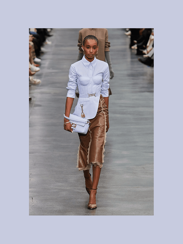
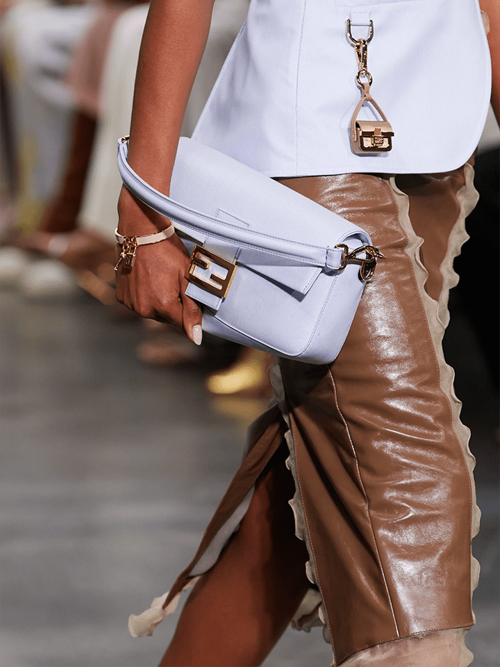
Photo by Carlo Scarpato for Gorunway.com, Courtesy of Fendi
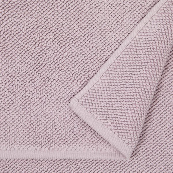
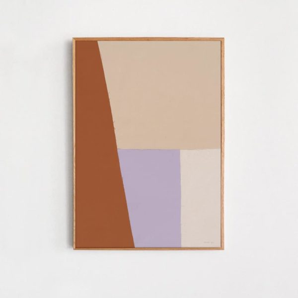
A Lilac Surprise
Unexpected but highly effective, this softened purple is incredible when used correctly
Daring and always challenging norms, Fendi wowed this season with their unconventional approach to colour pairings. Rich warm tones of brown and rust appeared alongside a kaleidoscope of gelati pastels, from mint green through to primrose pinks and of course, our favourite, lilac.
Lilac hit our colour radar hard after it was featured in Købn’s SS 21/22 collection late last year, and we were incredibly curious to see where and how it would be implemented. In the scheme of Autumn and Winter, it presents as a soft divider and the perfect colour device to help break up warmth.
Kat-Vice: Lilac is a softener. Paired against tans and mid-tone timbers, it creates an elegant focal point and reduces any overpowering warm tones.
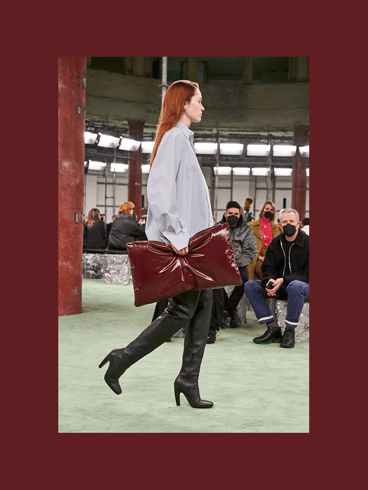
Photo by Alessandro Lucioni for Imaxtree, Courtesy of Bottega Veneta
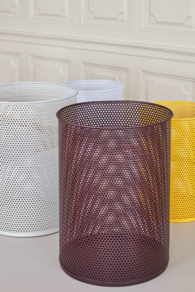
Wine & Dine
Nothing says sophisticated quite like a dash of deep burgundy
Catching our eye from Matthieu Blazy’s Bottega Veneta debut, was a plush oversized clutch. But it wasn’t the padding that made our jaws drop – albeit it a seriously hot design detail – it was the rich red wine that got the juices flowing and the desire to bring such a gorgeous tone into our home.
Deep reds, wines, and burgundies are a safe point of entry when dabbling in colour, especially for the neutral minded. Paired with beiges, soft greys, and even charcoals, it adds energy and richness to elevate quiet and subdued palettes.
Kat-Vice: Pair warm, deep reds with classic neutrals: beige, sand, and soft grey. You can even try experimenting with charcoal.
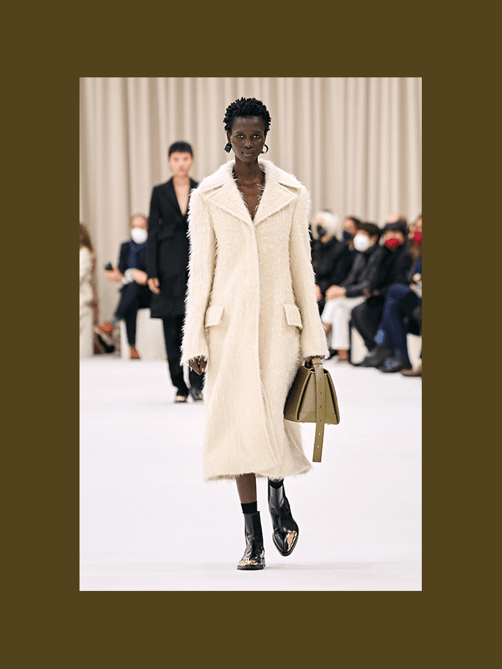
Photo by Alessandro Lucioni for Gorunway.com, Courtesy of Jil Sander
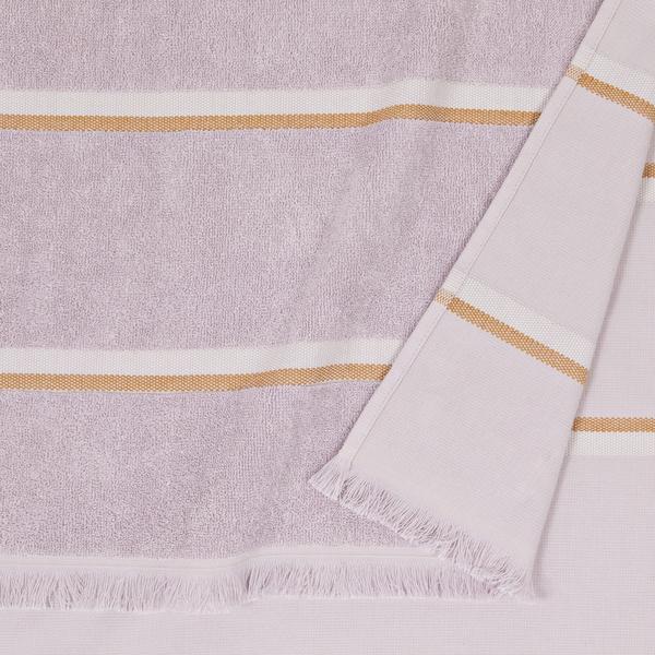
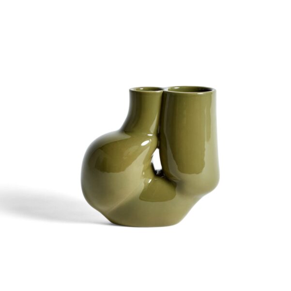
Olive You Very Much
The perfect tone to help ground loftier palettes
Minimalism is the foundation of design house, Jil Sander. So when you see colour in one of their collections, you know extra special care and consideration was taken. So when we saw a pop of olive green against a textured white coat, we knew this colour was a strong, cooler season contender.
We’ll herald this one as the perfect accent colour for Autumn, olive excels in its ability to link cool with warm. Almost brown/almost green, it’s a fashionable colour that proves exemplary against lighter objects, decor, and furniture. And the creamier, the better – those yellow undertones bring out a gentle warmth in olive coloured objects that really make them shine.
Kat-Vice: You’ll get the most out of olive green when you match it with light neutrals with yellow undertones.
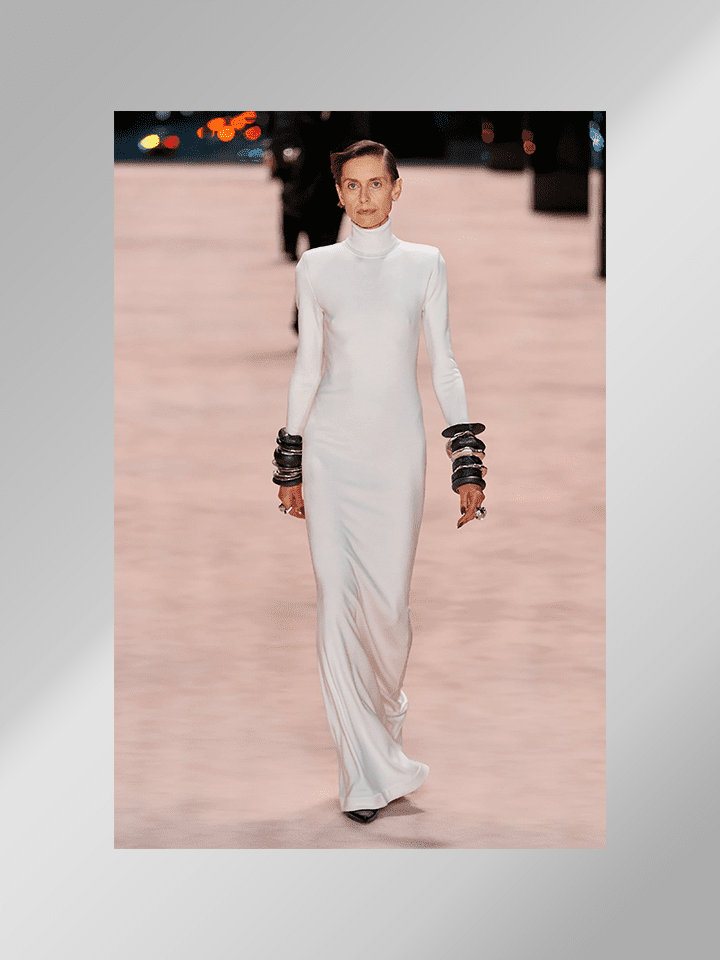
Photo by Alessandro Lucioni for Gorunway.com, Courtesy of Saint Laurent
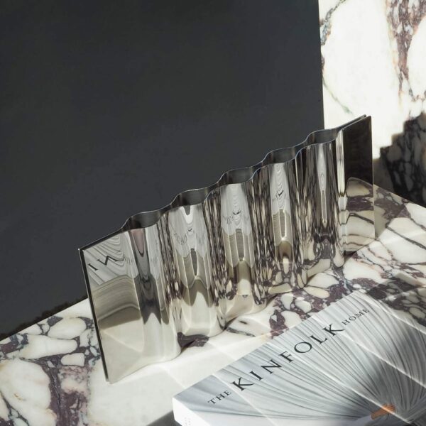
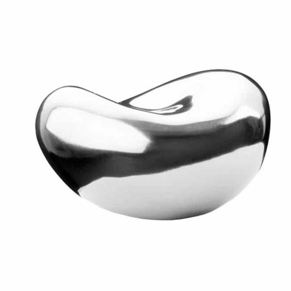
Silver Shimmer
A chic amplifier of warmth and cosiness
Saint Laurent often hits a little too rock’n’roll for our tastes – we’re more cool jazz – but this year’s Fall R2W collection certainly piqued our interest. Mature and elegant, the show featured chic silhouettes and monochrome colour palettes, accented with modest hints of silver accessories. And just like magpies, these shiny metallics got our hearts thumpin’ and brains envisaging.
Silver and chrome may not be an obvious choice in Autumn decor – it certainly presents as a cooler option – but hear us out. It all comes down to reflection. Polished silver has this cool chameleon effect, where it takes in its surroundings and shoots them back out. Surrounded by warmer tones, it can exaggerate the palette further and enhance the overall atmosphere, without adding overpowering tints you’d notice with yellow or gold brass.
Kat-Vice: Try adding hints of silver to areas of your home that feature a warmer palette. To add further interest, experiment with silver objects in twisted and organic forms – the warped reflections are a treat!