Oh Bea Lambos: the queen of curation, the champion of colour, and an all around cool person. Seriously. Her eye for style is as savvy as her sense of humour, and it’s all represented in her immaculately styled two-storey home.
All except for one room.
Behind a magnificent set of double doors – the first on your left after stepping through the front door – is the formal living area. A sage green space with a towering ceiling and fresh white shutters, its current function: a store room with grand dreams of becoming something so much more.
Tasked (read: challenged) by us to give the space a stylish kick start, Bea did what Bea does best – transformation via art. Curated from the collection of Designstuff favourite, The Poster Club, Bea hand picked a selection of printed art with the aim to completely redefine the space.
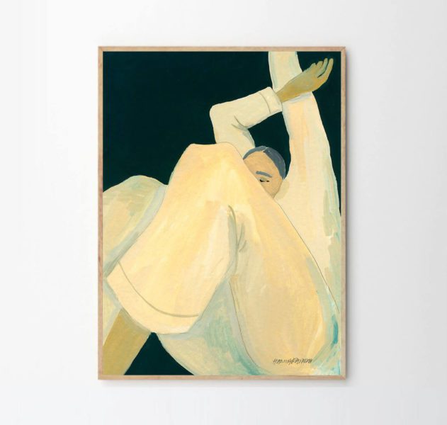
A literal blank canvas staring her in the face, Bea began her curation journey by starting with an internal deep dive. “Art is in the eye of the beholder,” she says. “And this beholder likes something with a bit of mood.” It was love at first sight after stumbling upon “The Dream” by Hanna Peterson, a yellow-toned piece featuring a sleepy subject waking from a deep and peaceful slumber.
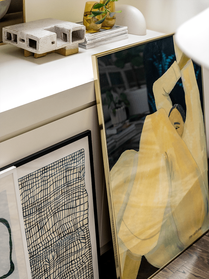
“It just really resonated with me,” recollects Bea. “Aside from the palette of softly saturated colours, it was the relaxed nature of the subject that caught my attention – she perfectly captures Melbourne’s sleepy, yet hopeful, emergence from almost 2 years of lockdown. Totally relatable.”
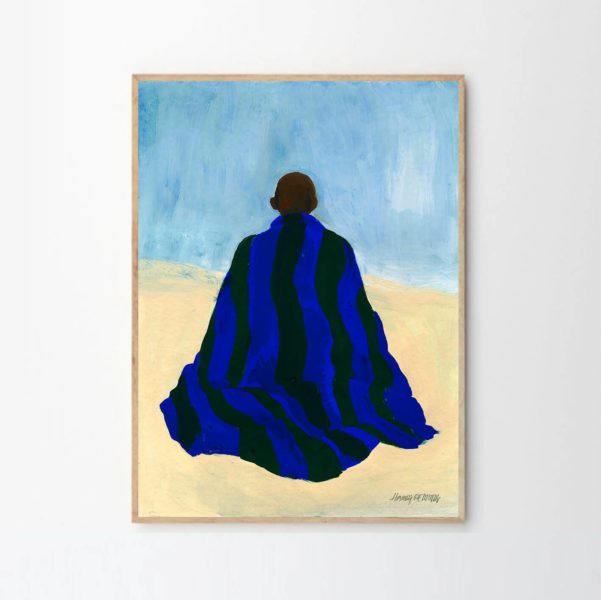
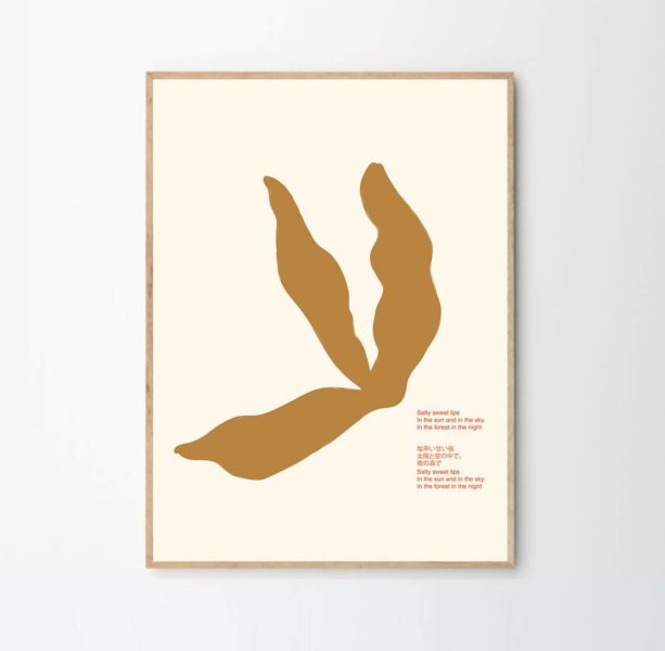
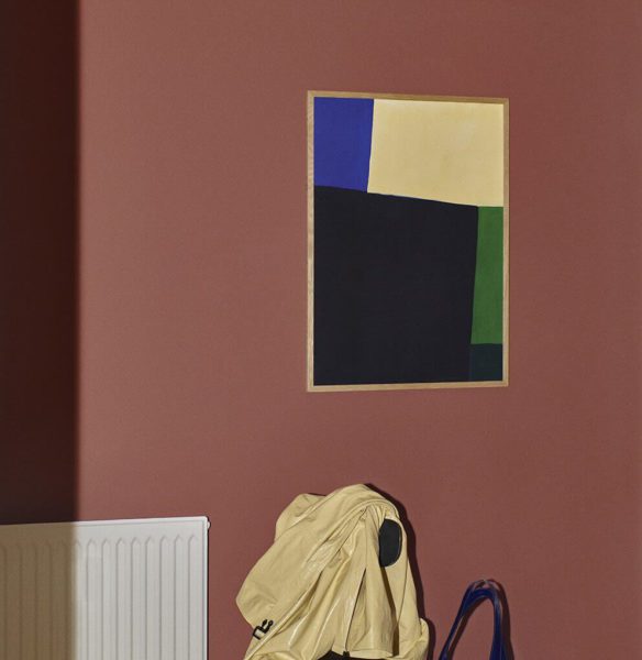
With a hero piece chosen, the collection began to take shape. Organic grids, leaf-like forms, meditative postures, and strong blocks of colour were introduced one by one. A technical act of balancing colour with mood and scale, the exercise also involved finding pieces that resonated with Bea and her family, whilst complimenting the character of the space. “The beauty of a gallery wall is in the story it tells,” says Bea. “I love the modularity; the way each individual piece vibes together, creating a narrative reflective of our family and home.”
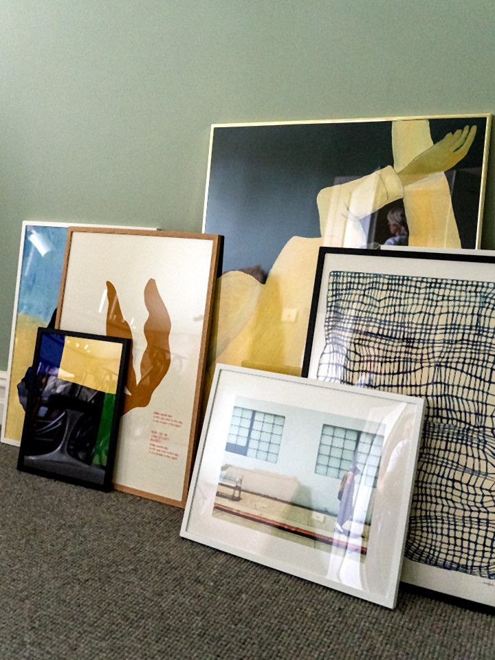
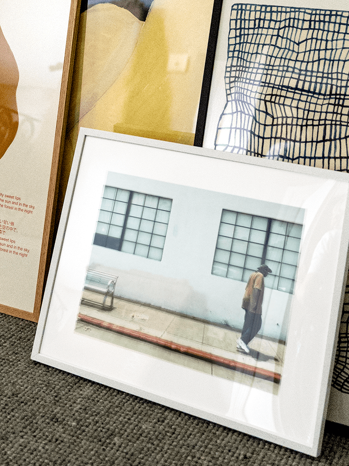
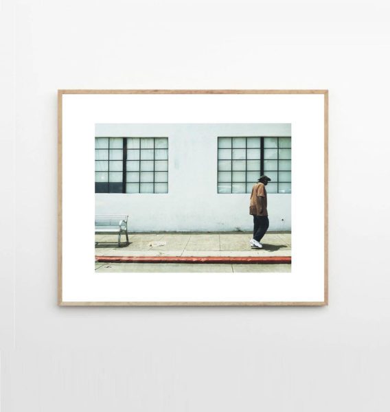
The final piece chosen for the wall was the “Santa Monica Man”, a photographic print by Christina Kayser O. “It took seconds for this nonchalant dude to steal my heart. Tee, slacks, clean white sneakers, floppy hat – the subject spoke to my inner cool cat,” says Bea. “He was the perfect finishing touch to tie everything together.”
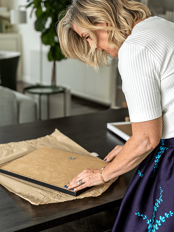
The process of framing and arranging took almost as much consideration as the curation process. And rightly so – a print in the right frame adds so much. “I try and use frames to emphasise what’s already there. If it’s a hero piece, I want the frame to also bring a heroic element,” says Bea, referring to the shiny gold frame housing “The Dream”. “Another trick I’ve picked up is to use frames as a focusing tool – if you want the eye to be drawn inwards, find a frame in colour contrast to the print. Alternatively, if you want to make the subject appear larger, find something in a matching colour. A white frame against a white border makes such a beautifully soft, yet elegant statement.”
And when it comes to the actual framing part, Bea has two points of advice.
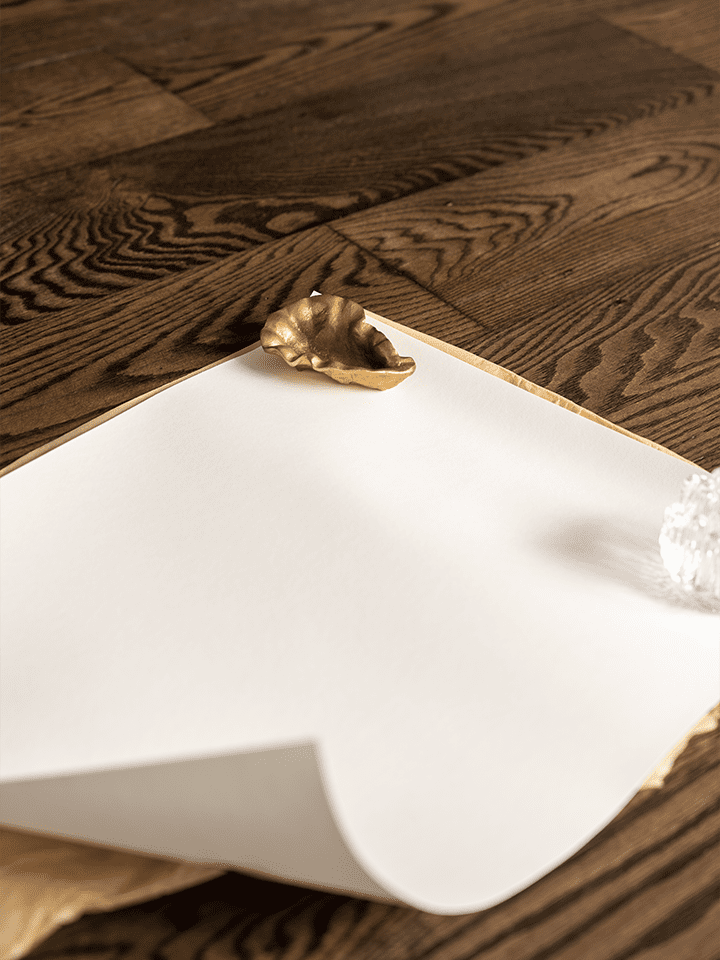
1. Prints that have spent time in a tube are going to be stubborn and reluctant to lay flat – give them time to straighten out under the weight of a heavy object.
2. The last thing you want is a big scratch on your brand new dining table. You can use the paper the print was packaged in as a protective layer when framing on hard surfaces.
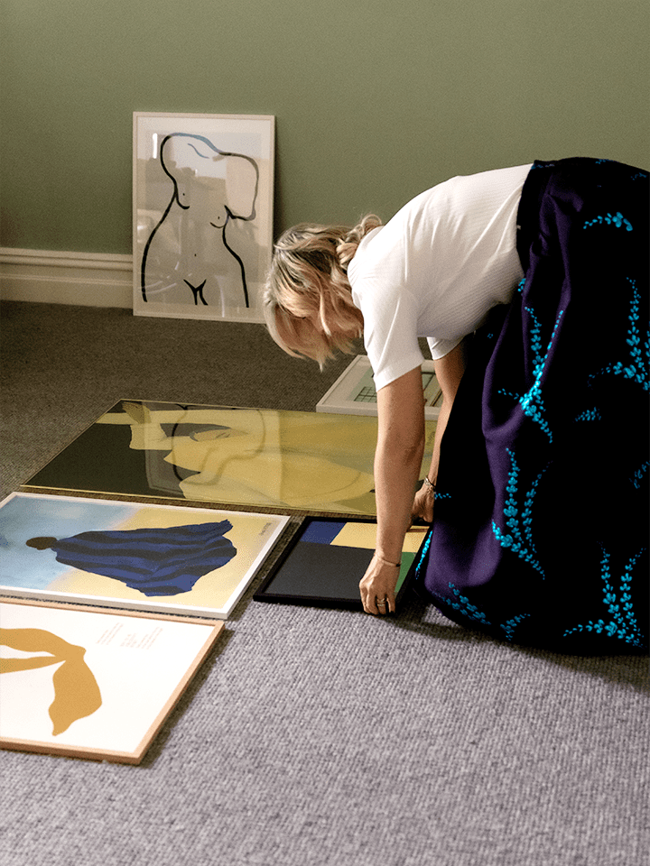
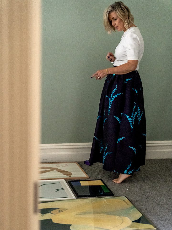
Creating the layout turned into an exercise of experimentation, guided by an understanding of design principles, common sense, and a little intuition. “My favourite part is creating the arrangement,” says Bea. “It requires me to use both my left and right brain, where creativity works hand-in-hand with logic and rules. What I’m looking for is a broad balance between size, colour, and subject matter.”
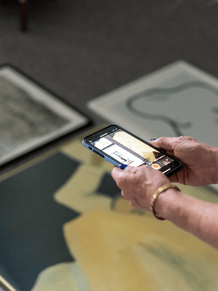
Bea recommends working in both the digital and the analogue worlds. “I like to start with potential layouts on a screen, where I can gather a general idea of the direction I should head in,” she says. “But I’ll always follow this up by trying things out for real on the floor. Things can turn out differently when viewed in the flesh, so I always make sure my eyes like what they’re seeing in the real world, as much as they enjoyed the mock up on the computer screen.”
Bea’s final piece of advice: don’t forget to take a quick photo of your layout on the floor before you get to work on the wall.
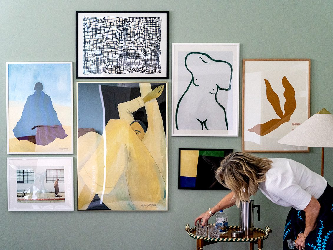
With the art framed and hung, the job was almost over. A step back gave Bea the time to analyse and admire the freshly decorated wall. “I like to think of my home as if it were a museum – a lifelong curation of objects and memories representing my family and our home,” she says. “I think this gallery wall is a starting point for the museum’s newest wing.”
A total success in her eyes – and ours too – the once empty room has started to take on a life of its own, thanks to the mood established by the new gallery wall. With plenty of room to expand, and furniture, lighting and floor-plan next on the agenda, we leave the space and can’t wait to see where it all goes next.
Watch this space.